Friday, 18 December 2015

Final - Colour Correction 1

Colour Correction 1

In Kenz and i's music video, we colour corrected a lot of our shots to try and make them seem more professional and all coordinate in a way so that they flow nicely with one another. In the clip below you can see how we colour correcting this shot of Alice and Jack walking in the leaves which we shot in a way that makes it look like Jack filming them. The original colour is quite bright and did not fit with our sequence of shots were we wanted it to so we made there be more highlights and less shadows and it gave us this effect which has a more muted and edgy feel to it. 


Final - Digipak Inserts

Digipak Inserts by Lola Gray and Mackenzie Dickey

Originally Kenz and i had only planned to include two inserts in our music album cover, but then after careful consideration we thought that it may be better to have another two just in case we need them. However, we did not want them plain and so instead we printed the lyrics of out song 'Crazy In Love' that we filmed and produced our music video too. I think that overall all of these pictures work well together as we edited them so they had a sort of muted effect of them so that the colors were not so vibrant and did not stand out as much. 


Final - Digipak

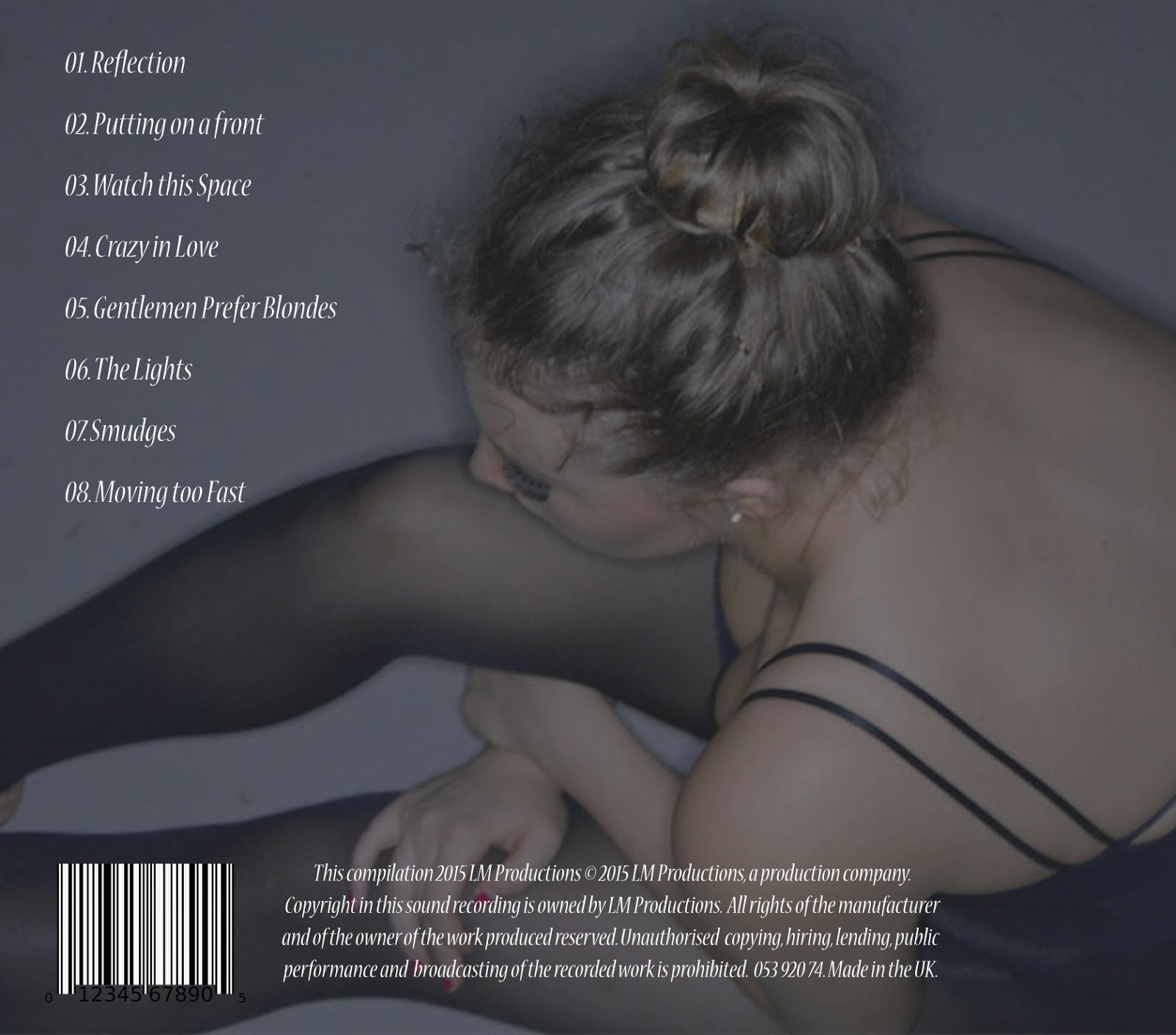
Final Digipak by Lola Gray and Mackenzie Dickey

Here is out final digipak, i am very happy with this final draft and think that it truly represents our music video as it includes some of the key elements that go alongside it. 

Front page

Insert on the left as case is opened 

Insert that sits behind the CD inside the case

The two below are behind the left hand insert in the case, to form a sort of booklet as such.


Back Insert

Final - Lighting

Lighting

Below are some of the different types of lighting that featured throughout out music video. the main and in my opinion the most effective lighting came from the pit as there was professional equipment that we could use in there so we took full advantage of this. The first four shots below are what we filmed in the pit, i think they turned out very well as we we could get different effects on the shots we wanted. For example, there were two different kinds of red lighting that we could depending on how many of the red washes over the lights we used. In the first shot you can see it is a lot brighter as we focused more lights on her face so that it just looked like a bright red spotlight. However, in the third shot the red is deeper and does not accentuate her features just as much, but i like how there is a difference and think this adds variety to out shots. We decided to use the red lighting as we thought that we could relate the fact that the song was about love and red denotes love. 

In the shots where we just used the white light in the pit, these were also different as we could change how many of the lights we used which all gave us a different effect. In some of the shots we were able to just get in half of her face with a shadow on the other side, i guess you could say that this relates to the fact that she is 'crazy' and that part of her is hidden. But then also, all of her face is in some of the shots. 


This shot is of Lauren in the dance studio which i know i have previously said that the lighting was not very good but once we discovered that we could dim the lights int he room we realised we could get some cool silhouette shots like this one of her stretching in front of the bar. I like these shots are they then coordinate with the shots below that of Alice and Jack which are also silhouettes. I think that all of these shots look professional and arty. Especially the ones with the couple as they have the added benefit of the lighting in the background giving the contrast between the two light types. 


Final - Digital Storyboard

Digital Storyboard

Here is our final storyboard, we decided to do it digitally so you would get more of an idea of the shots that we used. 


Tuesday, 15 December 2015

Final - Shot Types

Different uses of shot types

Below are a variety of different shot types that we used within our music video. I thought that i would just share a couple of my favourites. 

This first one is of Lauren where we have used a transition so that they it looks like there is two of her on the screen, we know that we could have overlapped the clips so that the Lauren's figure could have been more opaque but it did not look as good. If we did it that way then the background looked sharper and did not work as well. Overall i like this affect because there are two dances going on at the same time and mixes up the normal kind of long shot that can get repetitive. 


This is a close up of Lauren when she was dancing in the dance studio, we liked the fact that it was a close up and you saw her facial features whilst dancing whereas usually you would only be able to capture a dance in long shot or medium shot. It was quite difficult to get the shot but i think we did it well and was effective within the sequence. 


I liked this shot because it captures just Alice on her own but also gets in the fact that it was golden hour and so the beautiful scenery is blurred slightly and then Alice's hair is highlighted in the sun making her stand out. Also, you can see that she is looking at something which we liked as this 'thing' could be Jack. 


The next two shots coordinate with other as they come one after the other, we decided that they fit well with each other because as Lauren's leg lifts in the first shot it then goes straight into the next and spins but with more of a focus on her leg as the shot is a medium close up of the bottom half of her body. In the first shot it is a low angle of her as we thought that this create a change in our shots since a lot of them are filmed from straight on. Then we also thought that having a red light in the second shot would once again bring in the other shots from our music video so all of them relate. 


Monday, 14 December 2015

Final - Poster Advert

Final Poster Advert by Lola Gray and Mackenzie Dickey

This is the final version of our poster advert for our album 'The Lights'. I am happy with the way that this turned out and think that the image we have for it is perfect since it shows our artist is a beautiful light. The way we edited it was so that the background was darker that Lauren's skin so you could see the contrast between the two. I think that the pop of red really stands out and highlights the name of the song that we are promoting as this is the one we filmed our music video too and then also the 'S' on Scarlett and Simpson. We thought that having a touch of red throughout all of our ancillary products would be a good idea as then we could relate red to being Scarlett's (Lauren's) signature colour since also in our music video we film some shots with red lighting, we wanted to keep it consistent.